In this post, I’m going to show you 15 best wedding venue website designs that you can use as inspiration when building your site.
The fact that you are here reading this article tells me you value great design and want something better for your wedding venue.
We’ll here it is!
This is my expanded list of what I believe are some of the best wedding venue websites out there.
But before we dive in, let’s talk about websites and why they are so vital to the success of your business.
Why Should You Have a High-Performing Website?
Having a stunning website is only a piece of the puzzle.
Your site should be a well-oiled machine that drives in quality leads and sits on the first page of Google.
Here’s how you can accomplish just that.
- Build Brand Awareness
At the very top of the marketing funnel, we have brand awareness.
This helps with brand recall and retention.
When your customers are further down the buying process, they’ll think of you.
Not only that, but here is your first chance to differentiate yourself from your competitors.
Different is better than good, it’s unique.
- Create Trust & Credibility
Social proof is a very powerful tool.
Couples are more likely to engage with you if they notice other people are doing it.
In a sense, this is the bandwagon effect.
What better way to leverage that than by showcasing couple’s testimonials, past awards and stunning imagery from actual events?
- Increase Leads & Conversions
I think this is obvious.
But this is how you’ll get a majority of quality leads.
Not only that, but this is how couples will qualify you as a reputable venue.
Websites that tell a story, leverage amazing imagery and harness a clear call to action will win the lead.
- Display Your Value
Ask yourself, what sets your venue apart from others? What makes you special?
Your couples and their guests aren’t just coming for the ceremony, food or open bar.
Well, maybe for the open bar.
Couples want a unique experience that they’ll never forget. And guests should talk about their experience well after they leave.
There’s your gateway into the referral game!
- Promote Services
Are you more than just a wedding venue?
Maybe you also host corporate events, or offer lodging to your guests.
One pain point for couples is finding reasonable accommodations for their traveling guests.
If you have an Inn or showcase nearby hotels, you’ve now just eliminated one less issue for the bride and groom.
What Makes a Great Wedding Venue Website?
Here is a quick checklist to determine if your wedding venue website is an asset or a liability.
Keep in mind, this list should serve as a high-level overview.
But, it’s something to get you started.
Branding
Message: Is your brand’s message consistent throughout the site?
Brand Identity: Are you using a consistent color palette, font, icons and imagery?
Tone of Voice: How are your words coming across as you read each section of copy?
Emotion: Place yourself in the client’s shoes. What emotions are you feeling as you scroll and click through your site?
Graphic Design
Images: Specifically for wedding venues, do not use stock photos. Show off your environment with high-quality images.
Graphic Elements: Icons or other graphic elements should remain consistent throughout.
Typefaces: Rule of thumb, limit yourself to one or two different fonts.
Colors: Stay consistent and appropriate to your industry. Also, keep in mind that colors evoke certain emotions. So pick the right ones.
User Experience (UX)
User Flow: What goal do you want your user to accomplish and what does that roadmap look like?
Pain Points: Do your services offer a solution to any pain points leading up to the big day? Think back to the lodging issue from the previous section.
Navigation: Can users travel with ease through your site? Are they able to find vital information without difficulty?
SEO Optimization
Site Speed: How fast does your site load? This is very important. Load times improves your rankings in search engines and overall user experience.
Keywords: Are you ranking for the right keywords? Where are you showing up organically in the search results? You could be placing yourself in front of the wrong clientel.
Find Out How We Can Help Grow Your Business
Let’s discuss your marketing needs, and we’ll help you put together a digital marketing strategy that will generate more leads and save you time.
Our Picks for Best Wedding Venue Website Design
Ok, finally! Here’s what I’ve came up with in my research.
This list follows no specific order.
So let’s have some fun and get the creative juices flowing.
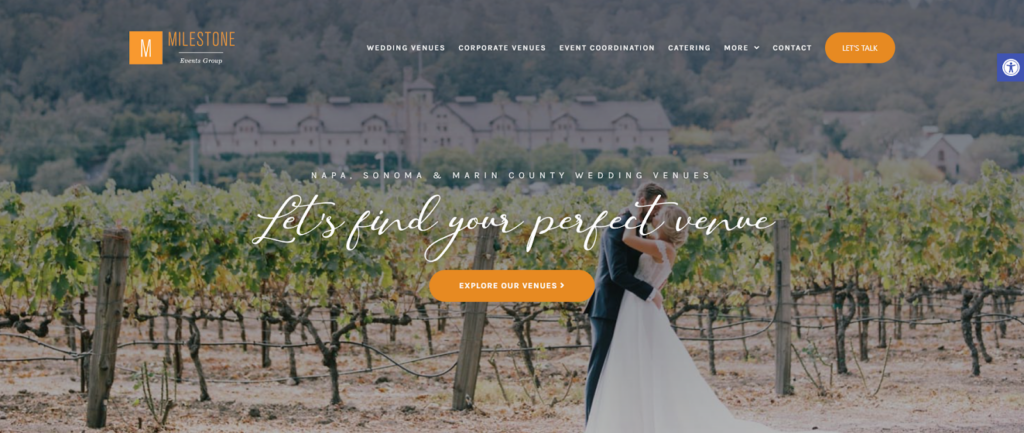
Milestone Event Group
Why It Works
I’d like to kick-off this list with a site made by us at the Johnson Jones Group.
The Milestone Event Group is a young venue, yet they’ve already receiving numerous awards for best wedding venue.
They have their accolades prominently displayed on the homepage, along with customer testimonials.
Perfect use of social proof!
Worth Mentioning
Opinions will differ here, but I personally like how they display their venue rates front and center.
Their diverse portfolio can accommodate a wide range of couples on any budget.
Not to mention, this acts as a filter and should increase the amount of quality leads funneling through their site.
Saphire Event Group
Why It Works
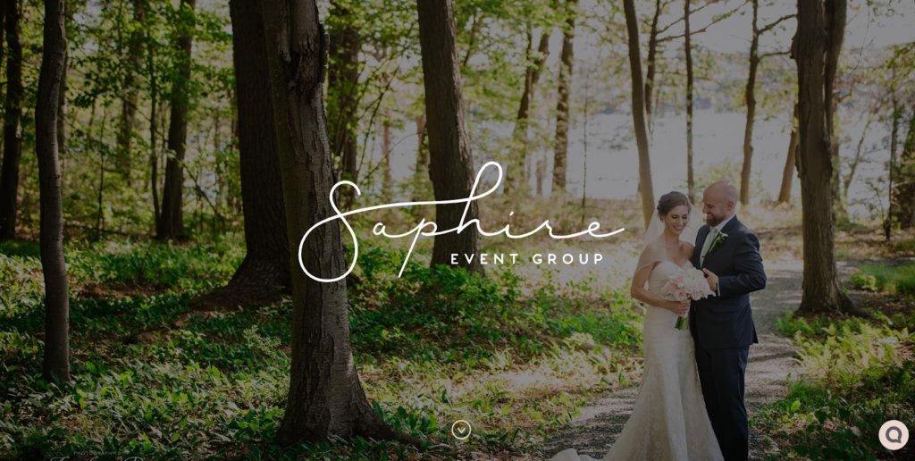
Notice the great use of typography and consistent call to actions.
The design team here used two complementary typefaces and created a clear hierarchy for information.
Each call to action is consistent throughout.
So as a user, you’ll never second guess whether something is clickable or miss out on a message.
Worth Mentioning
A website’s hero section gives you the opportunity to make a first impression.
Please excuse my industry jargon.
But just in case you’re not familiar with the term “hero”, I’m referring to the very first section of the homepage that is located just below the navigation bar.
What I love about this site in particular is how Saphire animated their logo.
Glasshouses
Why It Works
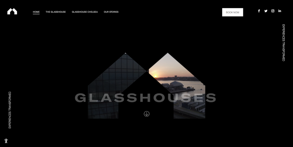
The designer made great use of white space, even though there is a lot of back being used.
This helps guide the user’s eyes to particular areas of the site.
I’ve seen my fair share of websites that flood pages with images and copy. Much like a newspaper.
Not every blank space needs to be filled.
Just remember this.
If everything is important, then nothing is.
Worth Mentioning
Ok, I have to mention this again.
Love the hero section here.
The video masked behind their bold logo is a very unique design choice.
And as you scroll through the site, you get a clear NYC vibe.
The Meritage
Why It Works
It’s won’t be the last time I mention this on our list.
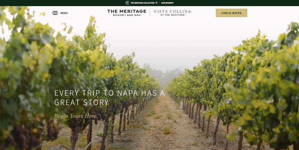
It’s all about the video background.
Videos in the hero make a statement.
They command attention and has that “wow” factor.
Just make sure to substitute the video for an image for your mobile users.
Worth Mentioning
I like it when designers overlap images and break the grid with content.
This is more of an advanced skill by following this notion.
Once you know the rules, you can break them.
Castle Green
Why It Works
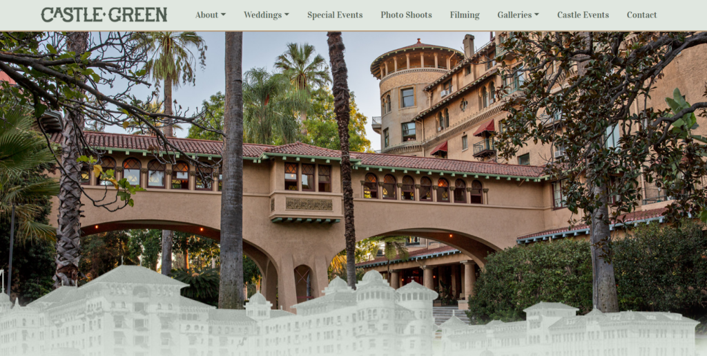
A website is meant to tell the user a story.
You can get a sense that this designer is conveying this principle with the scroll of the mouse.
As each section becomes animated, we begin to learn more about the venue and its value.
Worth Mentioning
Each section has line art illustrated in gold. This compliments the brand very well.
Personally, I think it’s being overused.
Nonetheless, the designer here did a great job pulling inspiration from the interior and exterior structures of the venue.
Rosewood Farms
Why It Works
Here’s another website from us at the Johnson Jones Group.
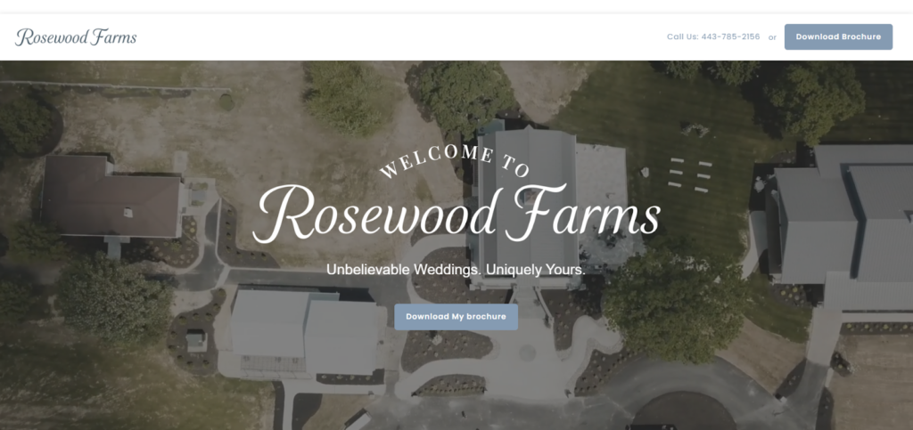
You’ll see this as a trend. We always push to get real photos from actual events.
Never use stock photos.
The images will sell your services without you saying a single word.
Worth Mentioning
I liked how the blog page turned out on this project.
You’ll notice clear call to actions and a consistent style in imagery.
Napa Valley Weddings
Why It Works
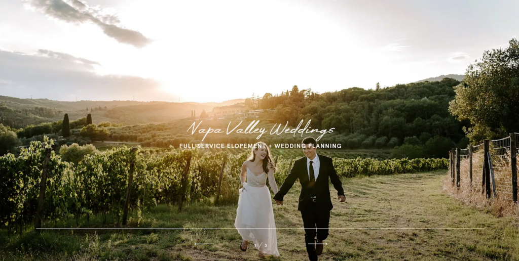
These guys really leveraged the beauty of Napa Valley in each photo.
And why wouldn’t they?
Rolling hills filled with grape vines that seem to travel indefinitely serve as a fantastic backdrop for any special occasion.
Worth Mentioning
Again, I love it when designers break the grid.
It’s very hard to pull off correctly. And that’s why we do not see it often.
But for some reason, it keeps showing up in our list.
The Estate Yountville
Why It Works
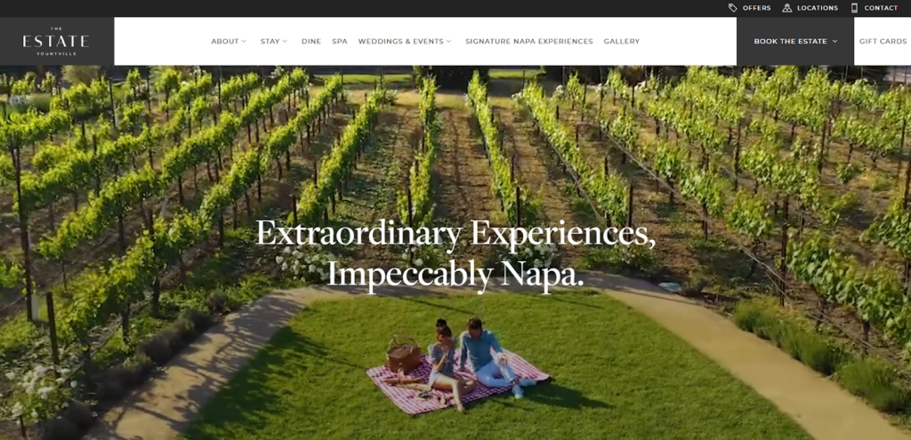
Okay, these guys check off all the boxes when it comes to great design.
But let’s talk about a few.
- Full screen video for the hero.
- Clear and consistent call to actions with hover animations.
- Complimentary typefaces with an established hierarchy.
- Resort quality photos.
- Custom icons
I could go on, but you get the idea.
Worth Mentioning
They are one of the few companies I’ve seen that actually hired models for a photo shoot at their actual venue.
The easy route would have been to use stock images.
Great job guys!
The Oceanview Nahant
Why It Works
I’m originally from Massachusetts, so this is a bit nostalgic.
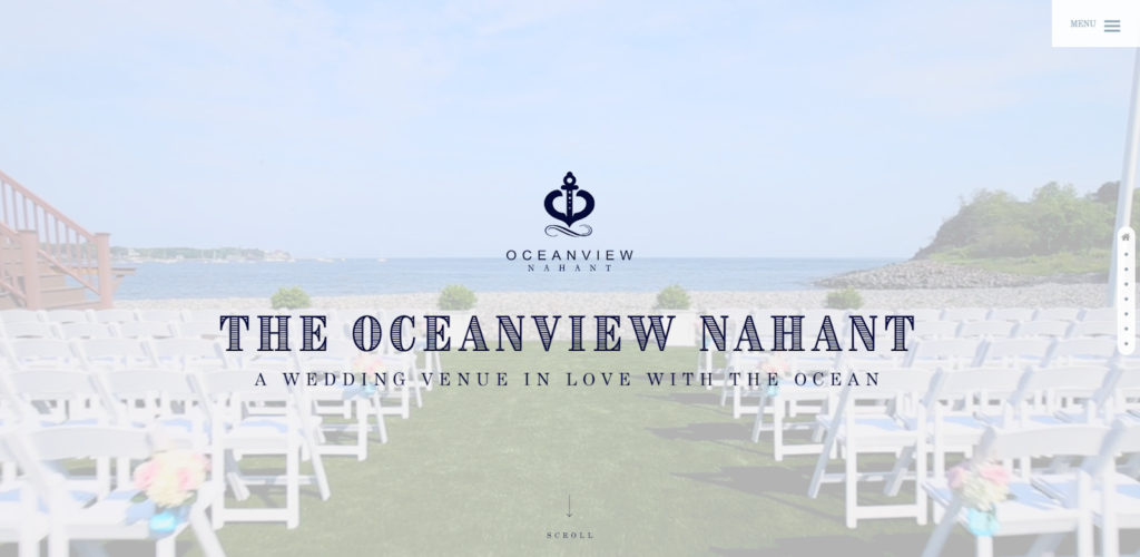
The designer here went all in on the nautical theme.
And that’s not a bad thing, because it clearly works.
No other wedding venue in the state is doing this. And if they are, it’s probably not well executed.
This is the kind of differentiation companies should strive for.
Worth Mentioning
I want to point out a pet peeve of mine.
I hate slide decks on websites.
They always look great, but perform very poorly in terms of user experience (UX).
But somehow, the designer pulled it off here.
I can easily navigate between sections and retain information.

Fetewell
Why It Works
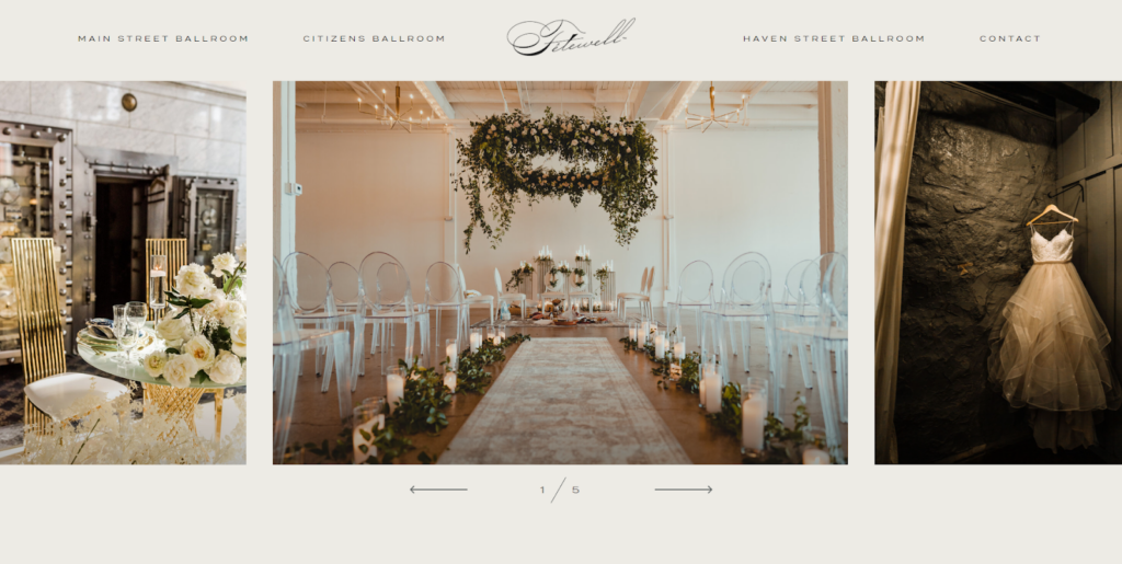
The designer perfectly translates the venue’s tone, look and feel into their website.
You can quickly tell that the color palette was sampled directly from the venue itself.
It’s as if you get a small preview of what to expect upon arrival.
Worth Mentioning
Those bold call to actions will not go unnoticed.
That dark green is only reserved for links. So Fatewell shouldn’t miss out on any lost conversions.
Greenbrier Estate
Why It Works
Here we have another website, courtesy of the team at the Johnson Jones Group.
Take some time to travel through this site.
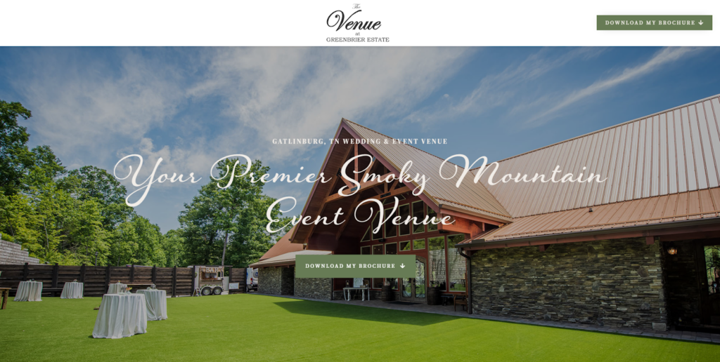
Aside from the ease of navigation, you‘ll quickly get a feel for what this venue offers through the use of diverse imagery.
We see the venue itself nestled in the forefront of the mountain side, couples enjoying a moment and action shots from actual events.
Worth Mentioning
The line art illustration of Gatlinburg’s Smoky Mountains adds to the character of this venue and gives this website a personal touch.
Glen Ellen Farm
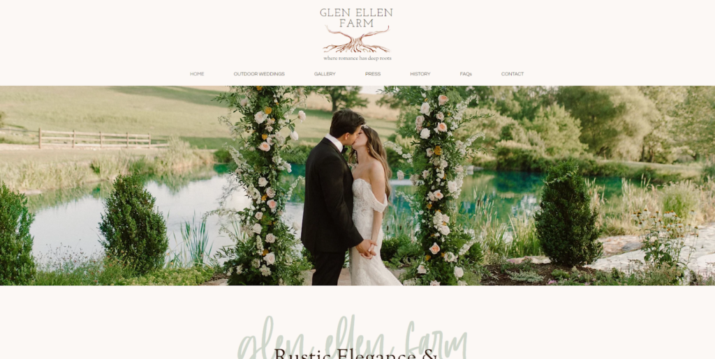
Why It Works
Their brand remains consistent throughout the site and pairs well with the overlapping illustrations.
Not only that, I personally found it very easy to navigate.
Worth Mentioning
Such great use of overlapping elements.
I like how the main typeface lays over the display font.
It’s still very legible.
Also, the designer uses the same technique for the call to actions.
Nestldown
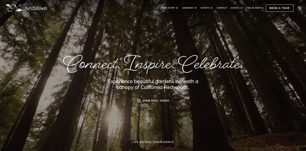
Why It Works
Here is an example of another site that stays on brand and uses tasteful illustrations.
As you travel through their site, you’ll notice the custom icons.
That just adds to the quality of this elegant website.
Worth Mentioning
Not only is the hero a video, but it allows you to open the video in a full screen format so you can watch it as originally intended.
Not going to lie, I ended up watching the whole thing.
Very well done!
Lakeview Pavilion
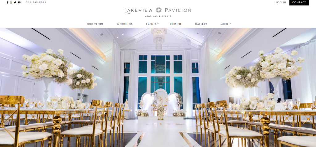
Why It Works
Aside from capturing the true elegance of this venue, the user journey flows flawlessly.
The information was easily accessible and I had many opportunities to convert as a user.
Worth Mentioning
I really enjoyed the simple illustration in the call to action buttons.
There’s nothing wrong with a simple rectangle with some words inside.
But this makes each button stand out on the page.
The Sanctuary on Penn
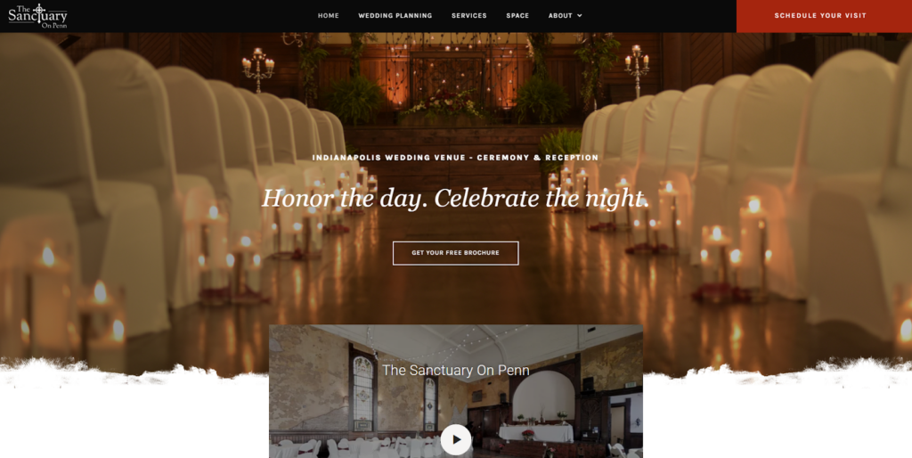
Why It Works
Lets end the list with a site from yours truly at the Johnson Jones Group.
The user journey leads the user to perform two specific call to actions.
For this project, we wanted to offer couples the option to book an appointment for a tour.
If a couple isn’t ready for that commitment just yet, we still have an opportunity to capture their information by downloading a free brochure.
Worth Mentioning
I’m a big fan of parallax images on websites.
It’s a great design trick when used sparingly.
Just don’t over do it by literally parallaxing every section.
We’ve all been on “those” sites.
Conclusion
Well, there you go.
You now have the inspiration and motivation to get started on your venue’s website.
If you want to work together, give us a shout.
We would love to collaborate to ensure your website is getting you more leads so you can book more events.
And hey, maybe you’ll end up on a list like this in the next year or two.

