In this post, I’m going to show you 9 best plumbing website designs that you can use as inspiration when building your new website.
The fact that you stumbled upon this article tells me you value great design and want to begin connecting with your customers on a deeper level.
Well I’ve put in the hours and came up with a solid list of what I believe are some of the best plumbing websites out there.
Before we get started, let’s briefly run through a checklist of “must haves” that will help you convert leads into customers.
Usage of Design Elements
Responsive Web Design
Your future customers aren’t always desktop users. With the obvious advancement of tech, people perform their research on an array of devices.
So optimizing your website for desktop, tablet and mobile has become industry standard.
Call To Actions
You would be surprised how many websites within the service industry lack in the call to action department.
We can’t assume customers know the next logical step towards using your service.
Without diving into the weeds, simply using the same call to action on every page, multiple times, will go a long way. Just be sure to not go overboard.

Color Palette
Choosing the right colors for your website is paramount.
Colors play a psychological role and evoke specific emotions in the customer’s mind.
For example, Blue and green tend to come off as friendly and build trust, while an excessive use of red and yellow lean more towards feelings of danger and anxiety.
Leveraging Content
Social Proof
Here is a great way to build trust and credibility with customers.
Examples of social proof are before and after photos of a job, online reviews, video testimonials, badges, awards and even showcasing how many years in business.
Copywriting
How many times have you visited a website and felt like you were reading a novel?
I’m willing to bet you didn’t last long before jumping ship.
We find that users skim written information and are more visual when gathering information.
Keep your copy short and to the point. Accompany that with powerful visuals, and you’ll have a winning recipe for converting new leads.
Quality Photos
As briefly mentioned above, relevant and quality photos are vital.
Stay away from stock images if possible.
Although ideal, not every business is expected to have a field photographer snapping pics while on the jobsite.
Showing before and after photos of a job well done, or team shots of your employees brings a human element to a website and builds credibility.
Examples of Plumbing Websites
Ok, enough with the geek talk.
Let’s look at some great examples of website design for plumbers.
While some of the following sites are not perfect examples of web design, I want to point out the positives.
Here we go!
Evolution Plumbing
Why It Works

The guys over at Evolution Plumbing have done a great job leveraging social proof.
Sure, you can simply post your best reviews on your site. They surely did.
But they took it a step further by summarizing customer testimonials from three different review sites.
Improvements

The header is taking up too much real estate at the top of the page.
If we scale down the logo and icons, we’ll see an immediate improvement.
Find Out How We Can Help Grow Your Business
Let’s discuss your marketing needs, and we’ll help you put together a digital marketing strategy that will generate more leads and save you time.
POM Group Plumbing
Why It Works

Here is a simple way POM Group Plumbing showcases the benefits of working with them.
The icons are appropriately paired up with each sub heading and the small paragraphs give a brief description of each point.
Improvements
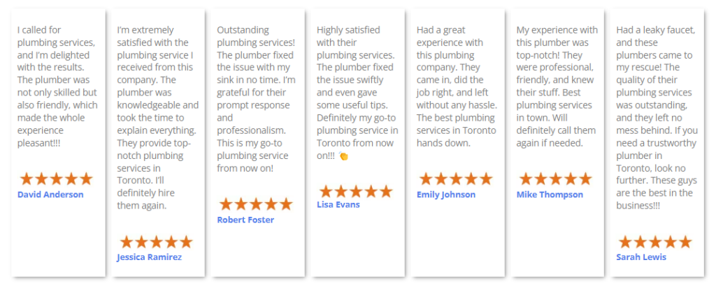
This section is sloppy and somewhat difficult to read.
Instead, they could have used three wide columns and have multiple reviews rotate on a rolling carousel.
Silver Tip
Why It Works
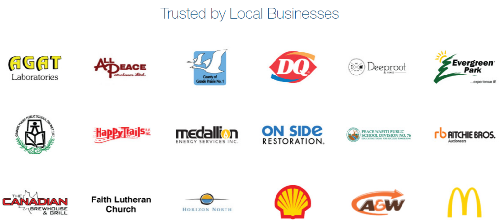
Another great use of social proof by Silver Tip.
Displaying your clients shows credibility and builds trust.
Especially if some of your clientele are monsters like McDonald’s and Shell.
Brag much?

Improvements
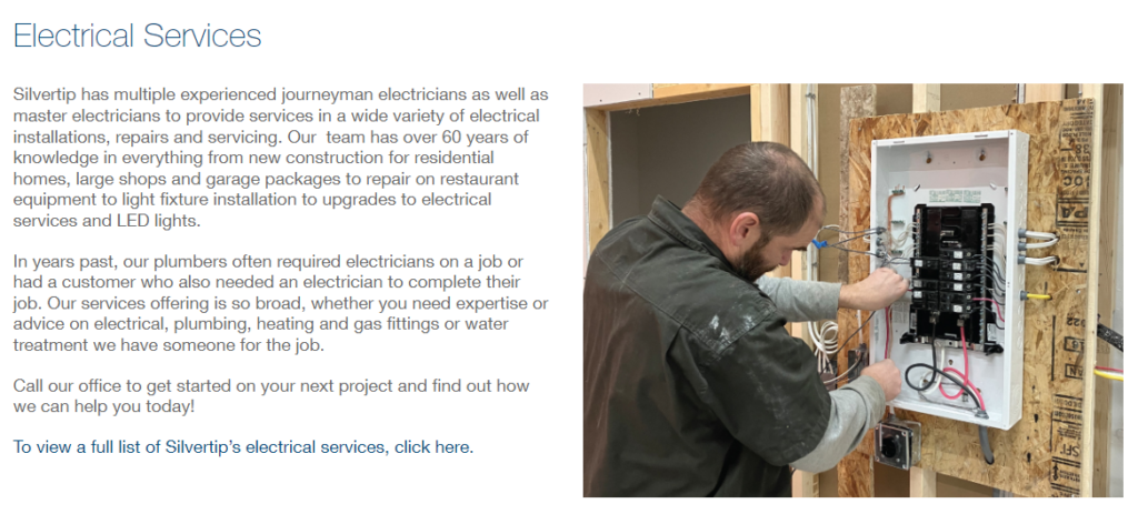
Can you see the call to action? Don’t worry, it took me a while to find it.
The blue lacks contrast when pinned up against the black body copy.
A quick fix would be replacing that line of text with a blue button containing shorter copy.
Impetus
Why It Works

This was a nice design choice from Impetus Plumbing.
They went with a black and white filter on their photos, leaving the gold to shine.
Improvements

Most companies are guilty of using too much text in their copy.
As mentioned, customers don’t spend the time reading long lines of text. They skim.
Heck, you may be glancing over this article, thus missing this key point.

Get to the vital information without adding too much filler and detail.
Pro tip! When displaying copy, keep your lines 7 to 12 words long. This prevents readers fatigue and helps them find the next line without losing their place.
The Pink Plumber
Why It Works
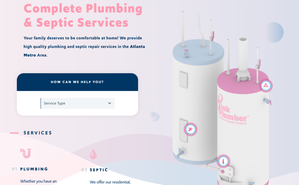
The team at The Pink Plumber did a great job using interactive design.
These water tanks dynamically move around your mouse curser upon hover, while the icons take the user to different pages across the site when clicked.
Give it a try!
Improvements

There is far too much going on in the navigation bar.
We have two coupons, two calls to action, a giant logo, and two rows of menu items.
The hierarchy of information could be improved.
Here’s the fix:
- Collapse the menu items into main and sub tabs.
- Scale down the size of their logo .
- Embed the coupons into a pop up that will trigger at different stages of the customer’s journey.

Absolute Plumbing
Why It Works
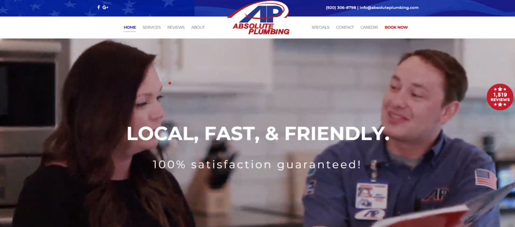
The hero section on Absolute Plumbing’s website uses a video background.
Not only is this design trend aesthetically pleasing, it shows a friendly interaction between a plumber and customer.
Improvements
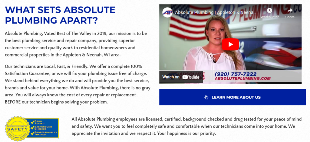
Misaligned content is the problem here.
It’s almost reminiscent of how newspaper articles are structured.
Mr. Rooter
Why It Works

Here is a great example of brand consistency.
You’ll notice that Mr. Rooter is never off brand. And they continue that trend in the digital space.
Brand consistency builds trust and increases recall in the customer’s mind.
Improvements

I take back what I said about consistency.

Let’s see if you can spot the error.
But what I really want to point out is their call to action usage.
There is no clickable button or link!
When building your website, add buttons where appropriate and avoid dead links.
GM Plumbing
Why It Works

At first glance, it’s just two wrenches. Nothing special, right?
But this is actually a loading animation.
Animations are useful because it makes the waiting time between pages far less frustrating and reduces the customer’s perception of time.

Improvements
Ok, here’s a short quiz. How many wrenches do you see?
A key principle of design is repetition, but with discretion.
I personally enjoy GM Plumbing’s branded pattern.
But if we were to delete the two red icons, we would see a noticeable improvement.
Nautilus Plumbing
Why It Works

The execution is spot on.
First we see happy customers enjoying moments in life. And these moments were made possibly by the team over at Nautilus Plumbing.
Next, you’ll notice a unique, yet clear, call to action.
Lastly, there are some scrolling animations at play; enhancing the quality and aesthetics of their website.

Improvements
Honestly, nothing to say here.
I wanted to end this list with a strong example of what a properly designed website should look like.
I could bore you with more examples. But maybe you should take a quick look for yourself.
Conclusion For Plumbing Website Designs
Well, there you have it.
This should give you a running start on building your new website.
If you need more guidance, give us a shout.
We would love to collaborate on your new website to ensure you’re getting quality leads.
And hey, maybe you’ll end up on our updated list within the next year or two.


